Tanveer Khan Data Scientist @ NextGen Invent | Research Scholar @ Jamia Millia Islamia
Data Visualization in Python
Data visualization is the representation of data or information in a graph, chart, or other visual format. It communicates relationships of the data with images. This is important because it allows trends and patterns to be more easily seen. With the rise of big data upon us, we need to be able to interpret increasingly larger batches of data.
Why visualize data?
- - To see variation between data-points
- - Showing relationships between variables
- - To Gain insights
Available Packages in python..!!
- - matplotlib
- - statsmodels
- - plotly
- - seaborn
- - bokeh
- - pylab
- - folium
1. Boxplot
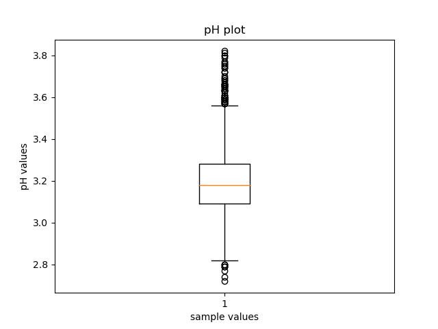
A boxplot is a standardized way of displaying the distribution of data based on a five number summary (minimum, first quartile (Q1), median, third quartile (Q3), and maximum). It can tell you about your outliers and what their values are.
And here’s code for boxplot of the pH values from winequality-white dataset.
import pandas as pd
import matplotlib.pyplot as plt


# Syntax for Boxplot plotting
matplotlib.pyplot.boxplot()

# reading the dataset
dataset = pd.read_csv("./winequality-white.csv)

# pH values have outliers
plt.boxplot(dataset['pH'])
plt.title('BoxPlot for pH values')
plt.show()
And here’s a boxplot of the pH values from winequality-white dataset.
2. Histogram
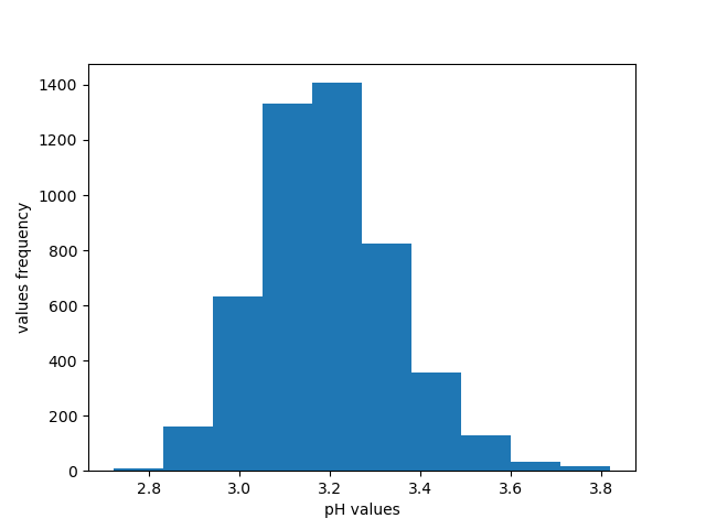
A histogram is a graph showing frequency distributions. It is a graph showing the number of observations within each given interval.
And here’s code for histogram of the pH values from winequality-white dataset.
import pandas as pd
import matplotlib.pyplot as plt


# Syntax for Histogram plot
matplotlib.pyplot.hist(.)

# reading the dataset
dataset = pd.read_csv("./winequality-white.csv)

# pH values Histogram
plt.hist(dataset['pH'])
plt.title('Histogram for pH values')
plt.show()
And here’s a boxplot of the pH values from winequality-white dataset.
3. 2D Scatter Plot
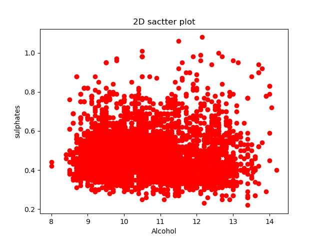
A scatter plot is a type of plot or mathematical diagram using Cartesian coordinates to display values for typically two variables for a set of data.
And here’s code for 2D scatter plot of the alcohol and pH values from winequality-white dataset.
import pandas as pd
import matplotlib.pyplot as plt


# Syntax for 2D Scatter plot

matplotlib.pyplot.scatter(...)

# reading the dataset
dataset = pd.read_csv("./winequality-white.csv")

#2D Scatter plot
plt.scatter(dataset['alcohol'],dataset['pH'],color='blue')
plt.xlabel('Alcohol_value')
plt.ylabel('pH_value')
plt.show()
And here’s a histogram plot of the alcohol and pH values from winequality-white dataset.
4. 3D Scatter Plot
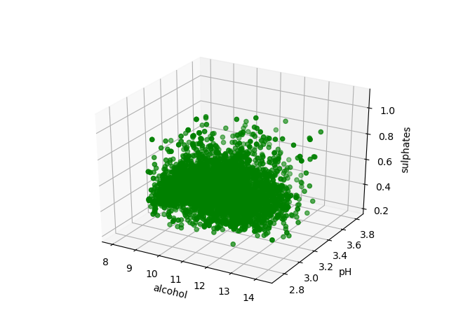
A 3D Scatter Plot is a mathematical diagram, the most basic version of three-dimensional plotting used to display the properties of data as three variables of a dataset using the Cartesian coordinates.
And here’s code for 3D scatter plot of the alcohol, pH and sulphates values from winequality-white dataset.
import pandas as pd
import matplotlib.pyplot as plt


# Syntax for 3D Scatter plot
matplotlib.pyplot.axes(projection ="3d").scatter3D(..)


#3D Scatter plot
axes = plt.axes(projection ="3d")
axes.scatter3D(dataset['alcohol'], dataset['pH'],dataset['sulphates'], color='green')
plt.title('3D scatter plot')
plt.show()
And here’s a 3D scatter plot of the alcohol, pH and sulphates values from winequality-white dataset.
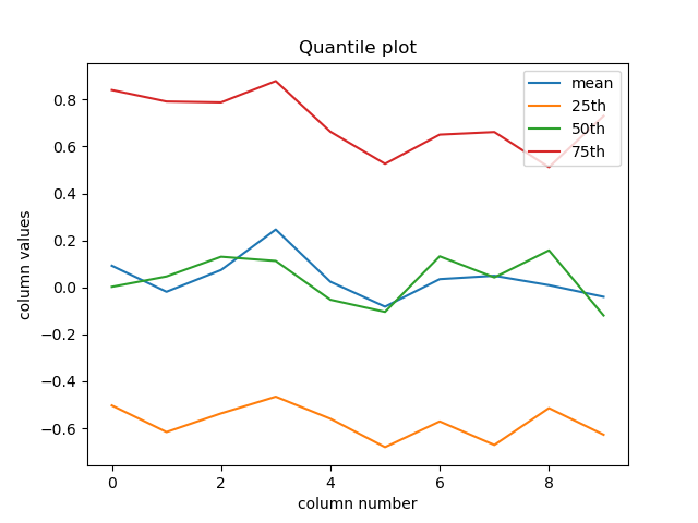
5. Quantile (Q) Plot
Quantile plot directly display the quantiles of a set of values. The sample quantiles are plotted against the fraction of the sample they correspond to.
And here’s code for quantile plot of a randomly generated dataset.
import pandas as pd
import matplotlib.pyplot as plt


  # Syntax for Q-plot
  pd.DataFrame({#QUANTILE_DATA}).plot(()

  # Creating random data
  data = pd.DataFrame(np.random.randn(100, 10))

  # Calculating all the desired values
  df = pd.DataFrame({'mean': data.mean(), '25th%': data.quantile(0.25),'50th%': data.quantile(0.5), '75th%': data.quantile(0.75)})

  df.plot()
  plt.title('Quantile plot')
  plt.show()
And here’s the generated quantile plot figure .
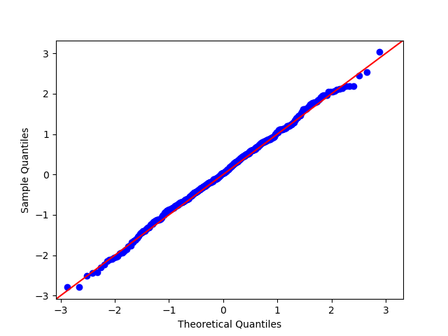
6. Quanttile-Quantile (Q-Q) Plot
The quantile-quantile (q-q) plot is a graphical technique for determining if two data sets come from populations with a common distribution.
And here’s code for Q-Q plot of the randomly generated dataset.
import numpy as np
import statsmodels.api as sm
import matplotlib.pyplot as plt


  # Syntax for Q-Q plot
  statsmodels.api.qqplot()

  normally_distributed = np.random.normal(0,1,500)
  sm.qqplot(normally_distributed, line='45')

  plt.title("Q-Q Plot")
  plt.show()
And here’s a Q-Q plot of the randomly generated dataset.
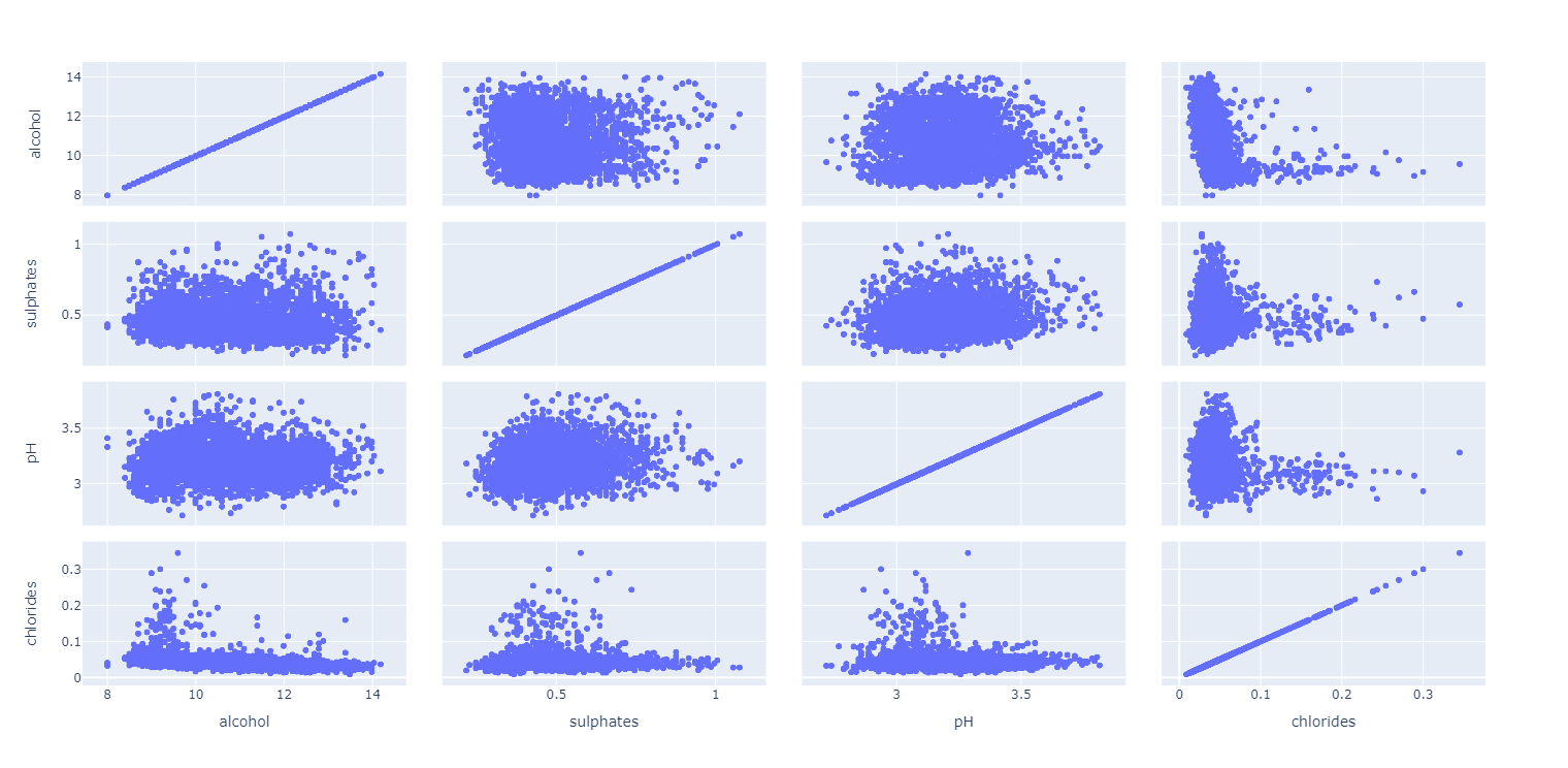
7. Scatter Plot Matrix
For data sets with more than four dimensions, scatter plots are usually ineffective. The scatter-plot matrix technique is a useful extension to the scatter plot. For an n dimensional data set, a scatter-plot matrix is an (n*n) grid of 2-D scatter plots that provides a visualization of each dimension with every other dimension.
And here’s code for the scatter plot matrix for the alcohol, pH, sulphates, chlorides, and density values from winequality-white dataset.
import pandas as pd
import plotly.express as px


  # Syntax for Scatter Plot Matrix
  plotly.express.scatter_matrix()

  # reading the dataset
  dataset = pd.read_csv("./winequality-white.csv")
  reduced_data = dataset[['alcohol', 'pH','sulphates', 'chlorides','density']]

  fig = px.scatter_matrix(reduced_data)
  fig.show()
And here’s a scatter plot matrix for the alcohol, pH, sulphates, chlorides, and density values from winequality-white dataset.
References
- Embarak, D. O., Embarak, & Karkal. (2018). Data analysis and visualization using python. Apress.
- Representation and Visualization of Data (2021). Retrieved 27 October 2020, from https://www.python-course.eu/machine_learning_data_visualization.php